Tutorial: Visualizing Global CO2 Emission Changes with Tabulate
Learn how to analyze and visualize global CO2 emission changes using Tabulate. Follow this step-by-step tutorial to transform raw data into insightful visualizations.

Jeremy Greze
Founder
Introduction
Welcome to our first demo use case with Tabulate! In this tutorial, we'll explore how to analyze and visualize data from UNdata on CO2 emissions from fossil fuel combustion. We'll walk you through the process of transforming raw data into insightful visualizations, all without needing any coding skills. Let's dive into how Tabulate can simplify your data analysis journey.
Video Walkthrough
If you prefer video content, you can watch our step-by-step tutorial below. The video is approximately 6 minutes long. If you prefer written instructions, continue reading for a detailed breakdown of each step in the analysis.
Step 1: Importing the Data
We'll start by importing the dataset containing CO2 emissions data from UNdata. The CSV file can be found here. Once you've downloaded the file, you can upload it to Tabulate for analysis.
Here is a preview of the "Table" in Tabulate after importing the CSV file:
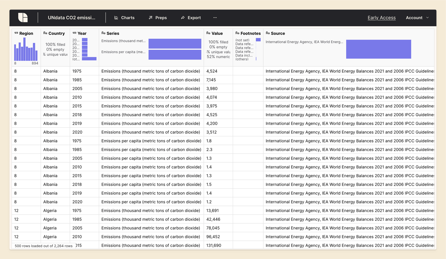
You'll notice that the data includes the following columns:
- Region
- Country
- Year
- Series
- Value (representing CO2 emissions in thousands of tonnes of carbon dioxide)
- Footnotes
- Source
The data is tabular, with each row representing CO2 emissions for a specific country, year and serie (Emissions or Emissions per capita).
Our goal is to analyze how emissions have changed between 2010 and 2020 for different countries.
Step 2: Cleaning Up the Data
Our first task is to improve the readability of our dataset. We’ll start by removing any unnecessary columns and renaming columns to more user-friendly names. This will help us focus on the most relevant information and make the dataset easier to work with.
To change our data, we first create a "Prep" (short for Preparation), on top of the Table. A Prep is a way to modify the data without changing the original Table. No data is lost.
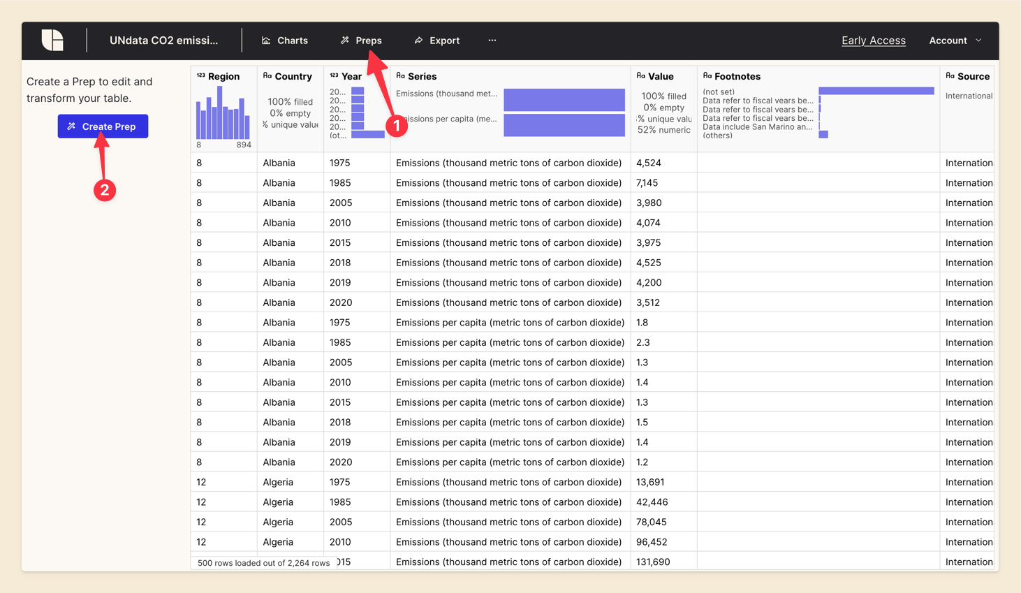
In the Prep, we'll perform the following transformations:
- Remove the 'Region', 'Footnotes' and 'Source' columns
- Rename the 'Value' column to 'Emissions'
Click on the 'Add a Step' button in the Prep and select 'Remove Columns'. Then, choose the columns you want to remove.
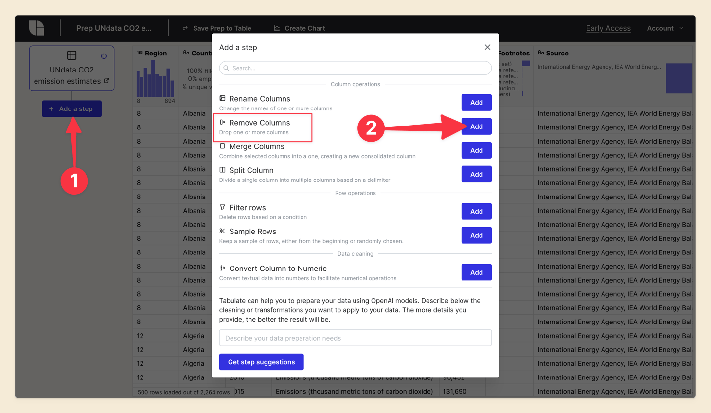
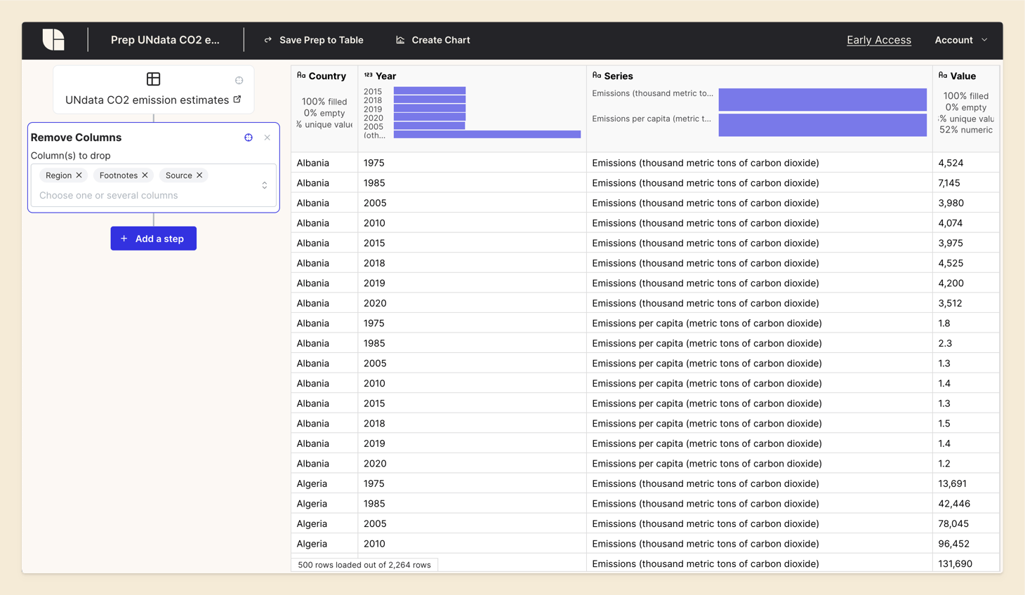
You can notice that the result is updated in real-time.
Next, click on 'Add a Step' again and select 'Rename Columns'. Pick the 'Value' column and enter 'Emissions' as the new name.
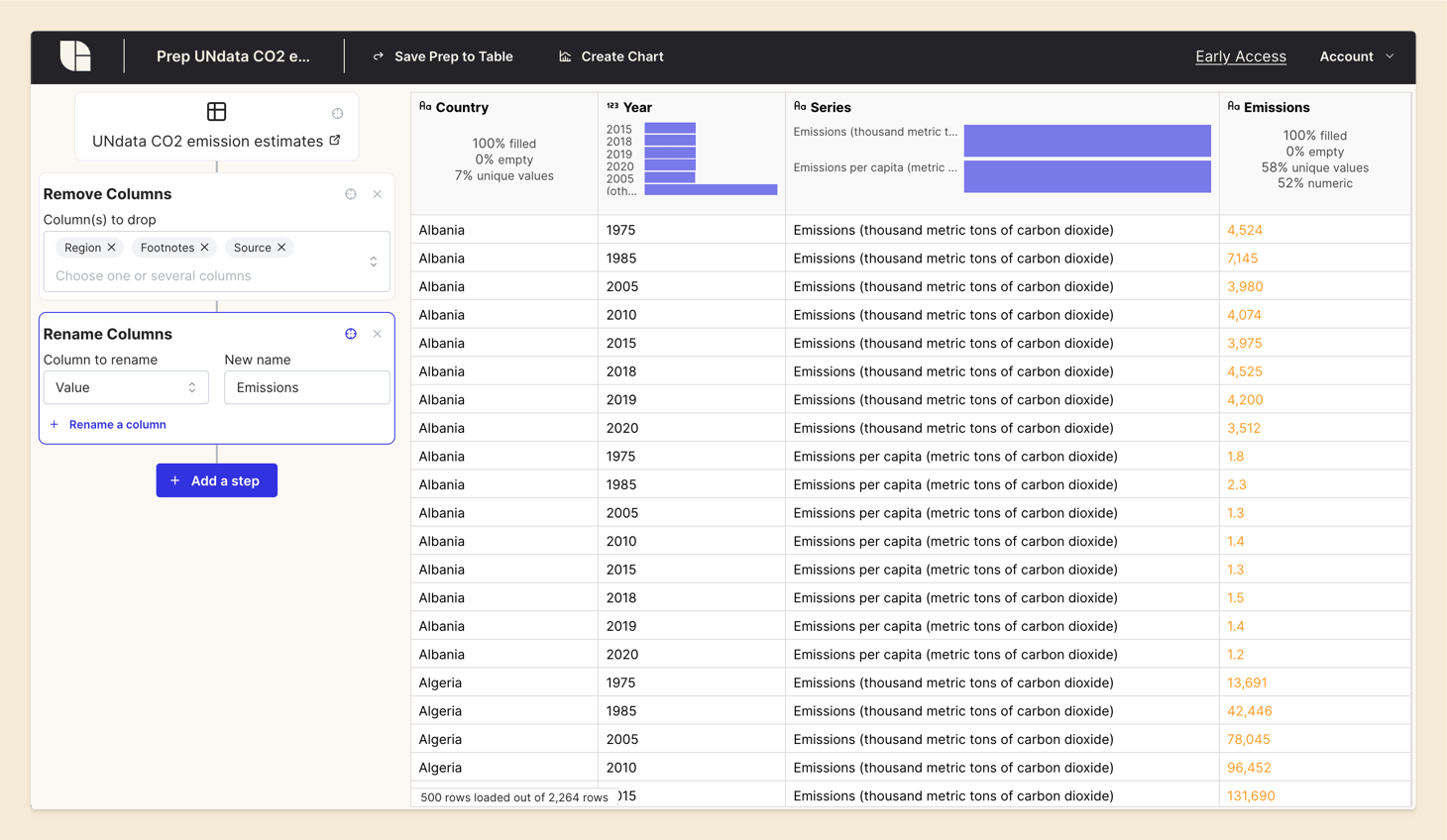
Notice how the transformations are chained in the left panel. The original data is represented at the top, and each transformation is applied in sequence. This way, you can always go back to a previous step and make changes. If you click on the Viewfinder Icon, you can see the data at any step.
Step 3: Converting Values to Numeric Format
Next, we need to ensure that the data in the 'Emissions' column is in a numeric format. This step is crucial for accurate calculations and visualizations. We’ll convert the values by handling any thousand separators and decimal points.
Shorcut: click on the 'Emissions' column header, a context menu will appear. Click on 'Convert to numeric'.
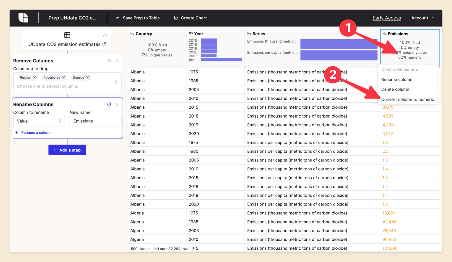
Choose the appropriate options for the conversion: dot as decimal separator and Comma as thousand separator.
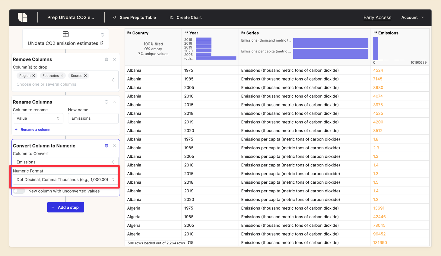
Notice how the little icon on the column header has changed to a number. This indicates that the column is now in a numeric format.
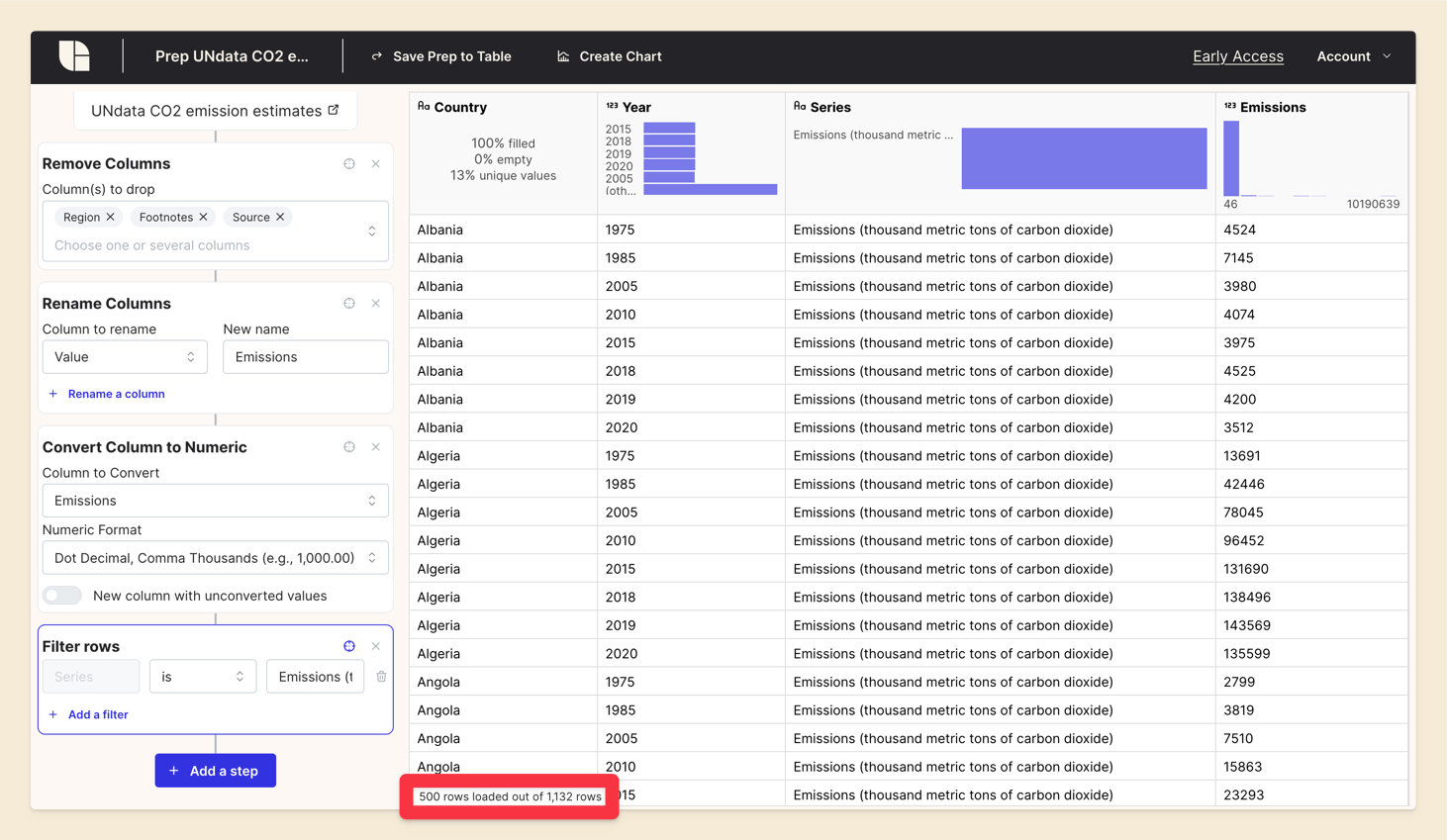
Step 4: Filtering Data for total emissions
In our "Series" column, we have different types of emissions data. The histogram header shows that we have 2 values: Emissions and Emissions per capita. For now, we are interested in the total emissions data, so we'll filter the dataset to keep only the rows where the 'Series' column contains 'Emissions'.
Click on the 'Series' column header, a context menu will appear. Choose 'Filter', then 'Keep rows equal to 'Emissions (thousand metric tons of carbon dioxide)'.
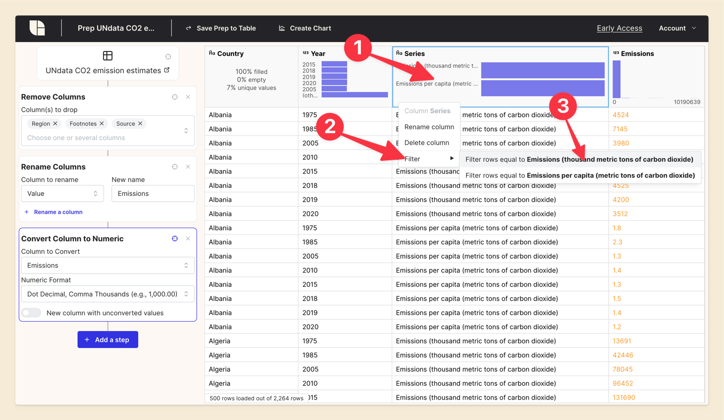
Notice how the total number of rows has decreased, from 2,264 to 1,132. We have filtered out the rows that contain emissions per capita data.
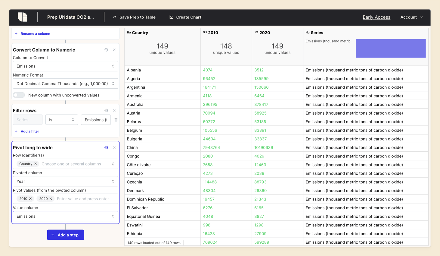
Step 5: Pivoting Data for Yearly Comparison
To compare emissions data between two years, we will pivot the data along the 'Year' column, keeping only the years 2010 and 2020. This transformation will condense our data so that each country has a single row with emissions values for both years in separate columns.
Before Pivot:
| Country | Year | Emissions |
|---|---|---|
| Albania | 2010 | 4,074 |
| Albania | 2020 | 3,512 |
After Pivot:
| Country | Emissions_2010 | Emissions_2020 |
|---|---|---|
| Albania | 4,074 | 3,512 |
Click on 'Add a Step' in the Prep and select 'Pivot long to wide'.
Fill in the fields:
- Row identifier: 'Country' (the column that will be used to group the data)
- Pivoted column: 'Year' (the column that will be pivoted)
- Value column: 'Emissions' (the column containing the values to be pivoted)
- Pivot values: '2010' and '2020' (the values to pivot)
Step 6: Calculating Emission Differences
Now, we’ll use a formula to compute the difference in emissions between 2010 and 2020 for each country. This step will help us understand how emissions have changed over the decade.
Click on 'Add a Step' and select 'Formula'. Enter a name for the new column, such as 'Difference', and input the formula to calculate the difference between 2020 and 2010 emissions. To reference other columns in the formula, use backticks (`) around the column names, or you can use the function, column("Column Name").
Formula:
`2020` - `2010`
or:
column("2020") - column("2010")
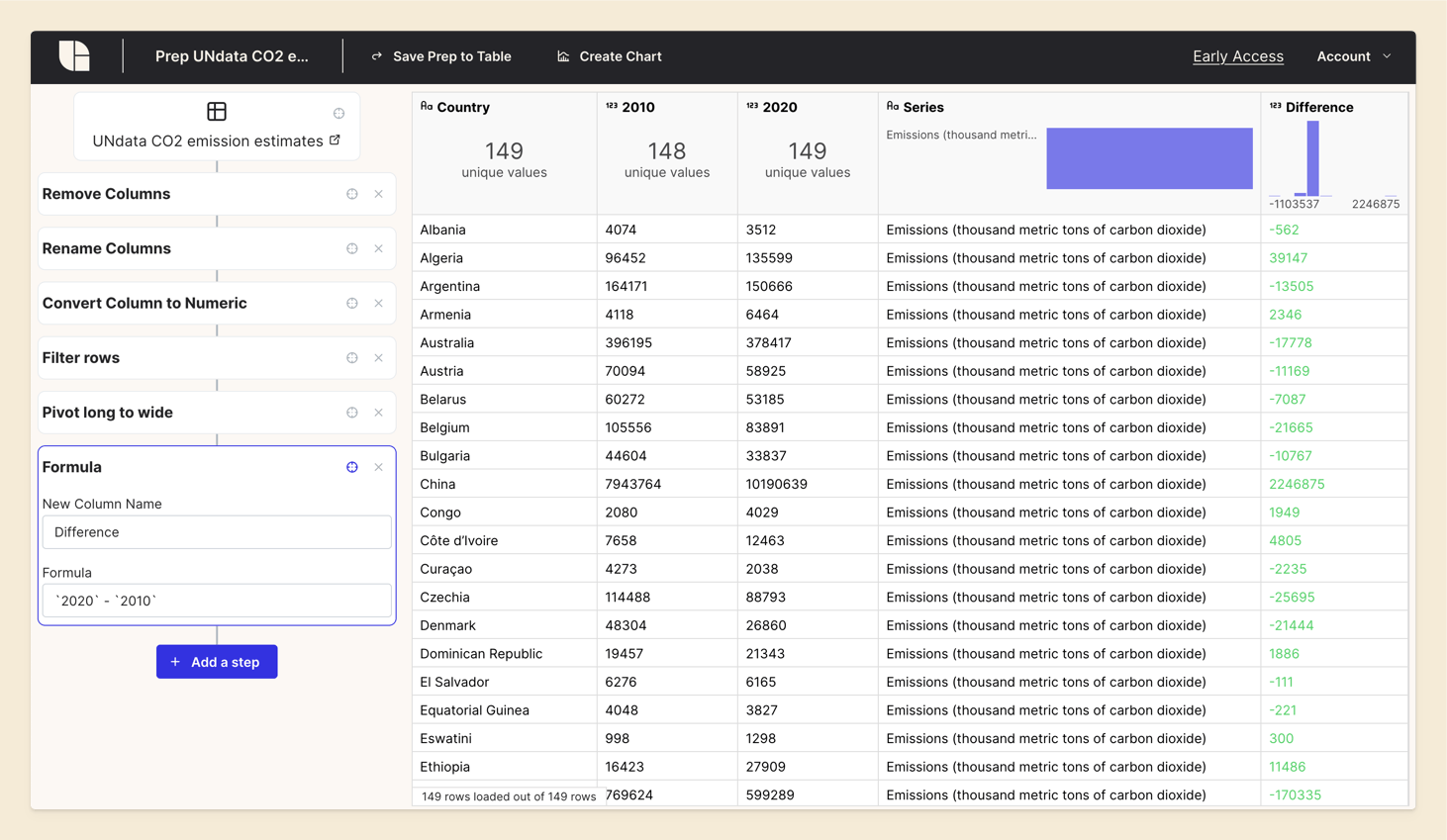
This new column shows the increase or decrease in CO2 emissions for each country.
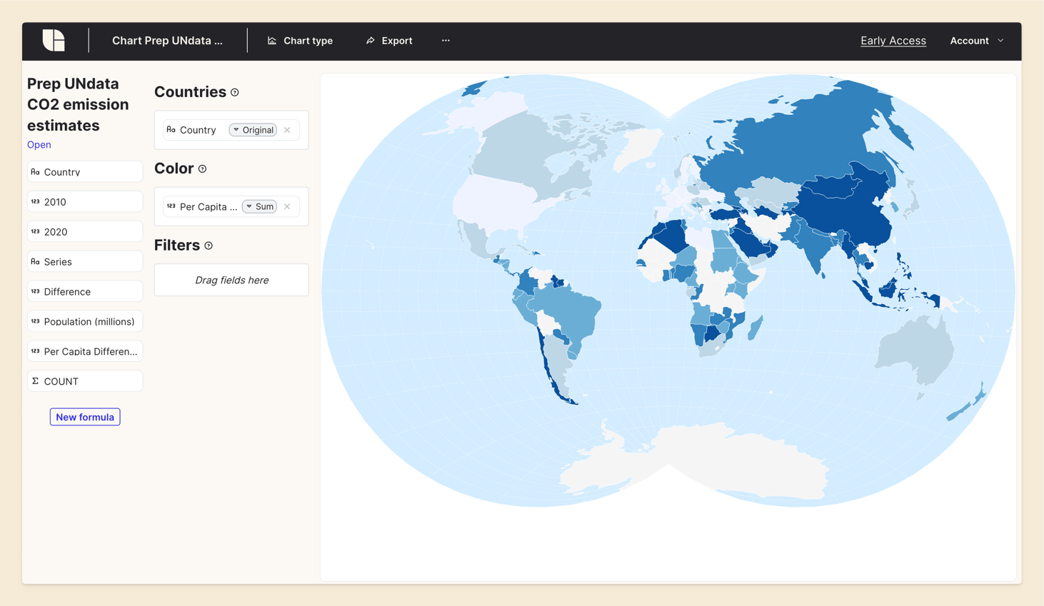
Step 7: Visualizing Data on a World Map
With our calculated differences, we can create a world map visualization. This map will display the changes in CO2 emissions for each country, providing a clear and intuitive view of global emission trends.
Click on 'Create a Chart' at the top. The data visualization view will open. Select 'Map of world countries' as the chart type.

Drag and drop the 'Country' column to the 'Countries' field, the 'Difference' column to the 'Color' field.
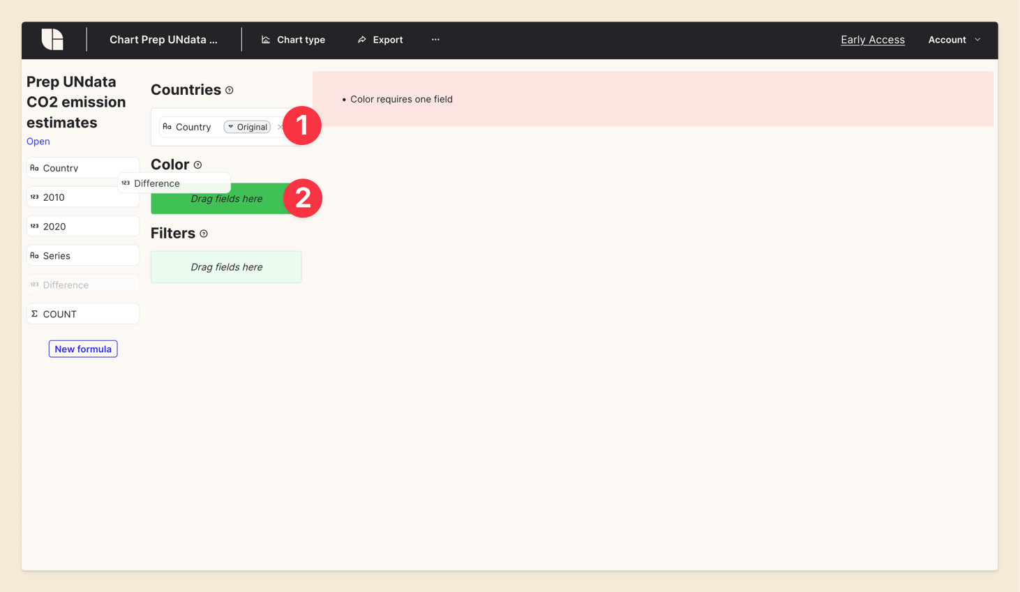
The data visualiezation of Tabulate works on unaggregated data. (More on this in a future blog post.) We need to aggregate the data to show only one value per country. Click on the 'Aggregation' button and choose 'Sum'. Note that any aggregation method can be used here as we have only one value per country.
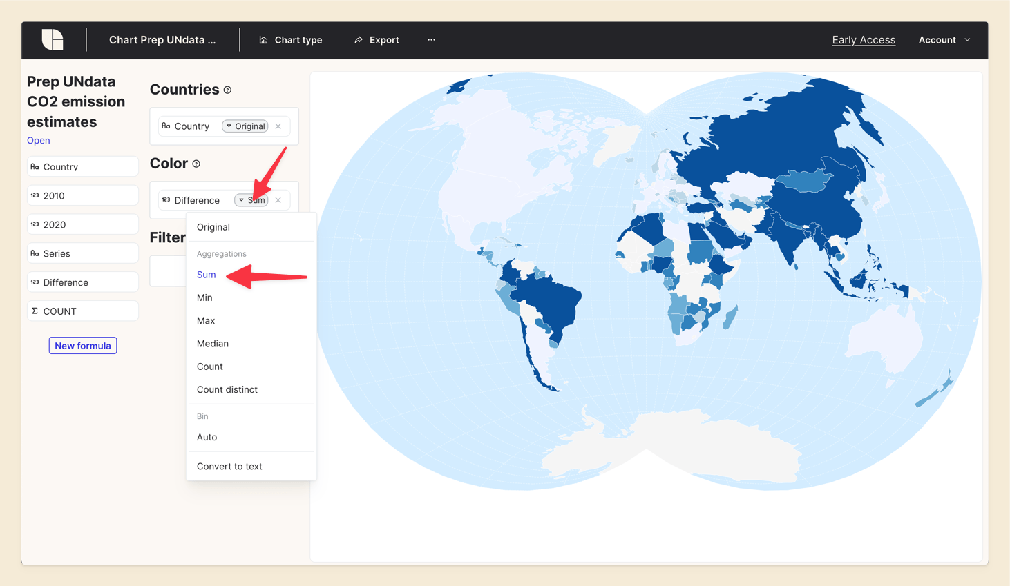
We can see the world map with the color scale representing the emission differences between 2010 and 2020. The map provides a visual representation of how emissions have changed over the decade.
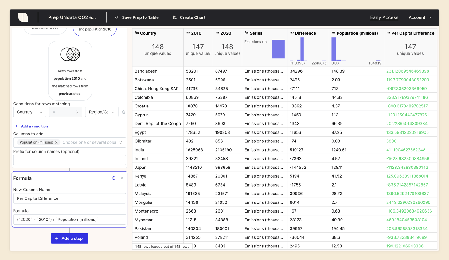
Step 8: Adding Population Data
To further refine our analysis, we want to show the per capita emission differences.
We could come back to our filter step and keep the rows with 'Emissions per capita' in the 'Series' column. But we'll take another approach here to demonstrate another feature of Tabulate.
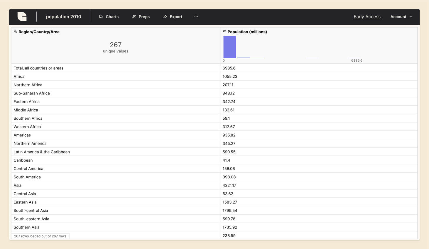
For this purpose, we’ll incorporate an additional dataset containing population counts for each country. Let's download the population dataset here that is derived from UN data. We import it into Tabulate.
We come back to the Prep of our orginal Table. We click on 'Add a Step' and select 'Add columns from another table'.
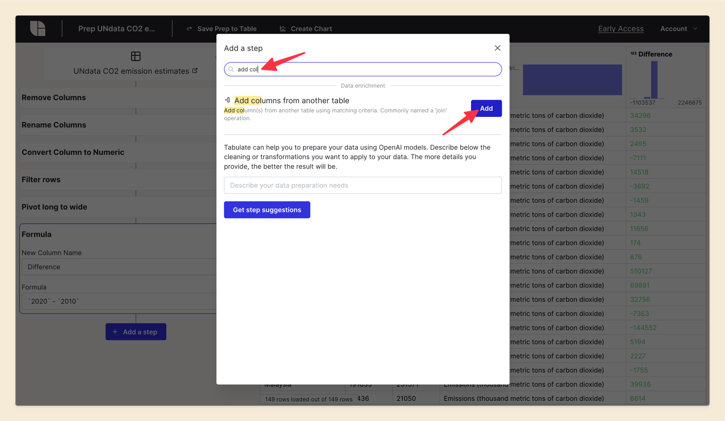
Fill in the fields:
- Table: 'population 2010'
- Relation type: 'Keep rows that have matching values in both tables'
- Condition: 'Country' in the original table is equal to 'Region/Country/Area' in the population table
- Columns to add: 'Population (millions)'
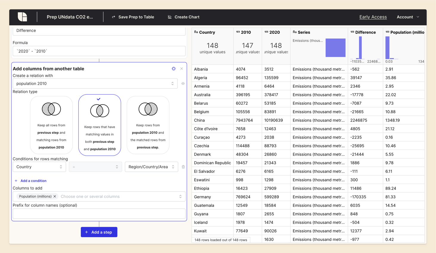
The population data is now added to our original Table. We can see the new column 'Population (millions)'.
Step 9: Calculating Per Capita Emission Differences
Create a new formula to calculate the per capita emission differences. This adjustment allows for a fairer comparison between countries with different population sizes.
Click on 'Add a Step' and select 'Formula'. Enter a name for the new column, such as 'Per Capita Difference', and input the formula to calculate the per capita difference.
(`2020` - `2010`) / `Population (millions)`
Step 10: Redrawing the Map
Finally, we’ll redraw the world map to visualize the per capita emission differences. This enhanced map will provide deeper insights into how emissions have changed relative to population sizes.
Conclusion
With Tabulate, transforming and visualizing datasets becomes easy and intuitive. This demo showcases how to analyze and visualize global CO2 emission changes over a decade. By following these steps, you can turn raw data into meaningful insights without the need for coding skills. Stay tuned for more use cases.
If you have any questions or feedback, feel free to reach out to us. We're here to help you and improve our software based on your needs.